Layout
A strong layout cohesively ties the individual parts together in a harmonious manner.
Overview
Think of the layout as a stage on which all the elements and components of your website are approachable and easily understood.
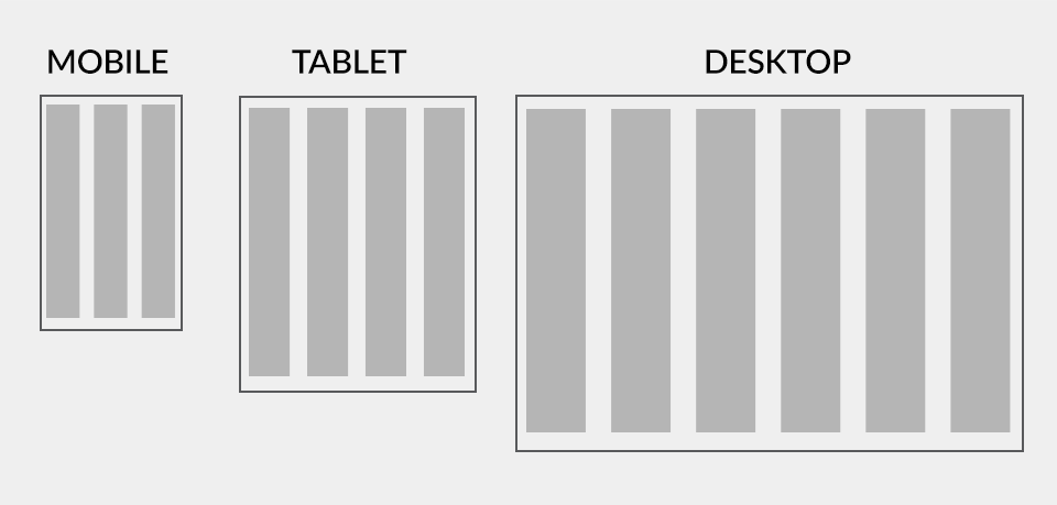
The Grid System
Using a simple system of columns and rows, a grid lays out content in an orderly and consistent manner.
Our grid is primarily based on sections and columns that will help balance, enhance and organize all of your content across any screen size (known in web design as “responsive” layout). You can select blocks of columns to act as staging areas for an assortment of elements and components.
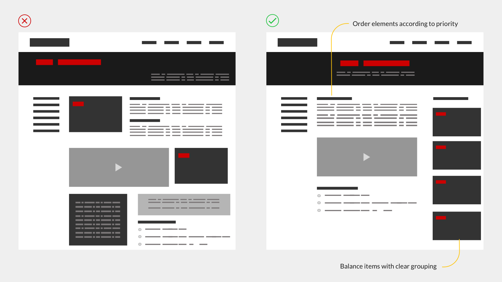
Organizing Content
Gestalt is a set of principles concerning groupings and relationships as they relate to one another and to how people naturally perceive objects as organized patterns. Four key ideas will help you make informed decisions on how you should layout content on the site: proximity, similarity, symmetry and continuity.
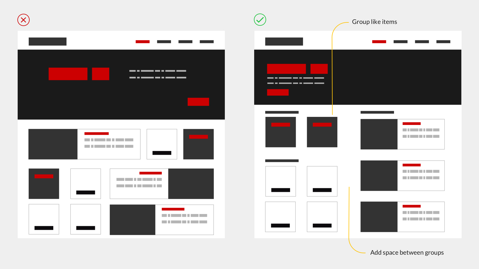
Proximity
The Gestalt law of proximity states that “objects or shapes that are close to one another appear to form groups.” From a web design standpoint, items that are related should stay close to each other, while the unrelated items should stay further apart.
The concept of proximity can be applied to many items, including navigation, cards and banners as well as lists, body text and pagination.
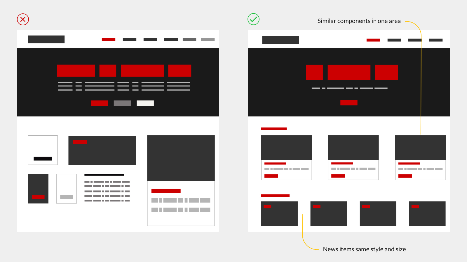
Similarity
Elements sharing similar visual characteristics are perceived to be more related than those not sharing similar characteristics. This idea aids in classifying and organizing objects by group and linking them with a specific meaning or function.
The principle of similarity can be used with headings, links, components, call to actions and more.
Symmetry
Balanced elements are perceived as relating to each other, thus creating a feeling of solidity and order. Symmetry feels comfortable helping us focus on what’s important.
Listings, banners, contacts and any content-heavy page are improved when symmetry is incorporated into the design.
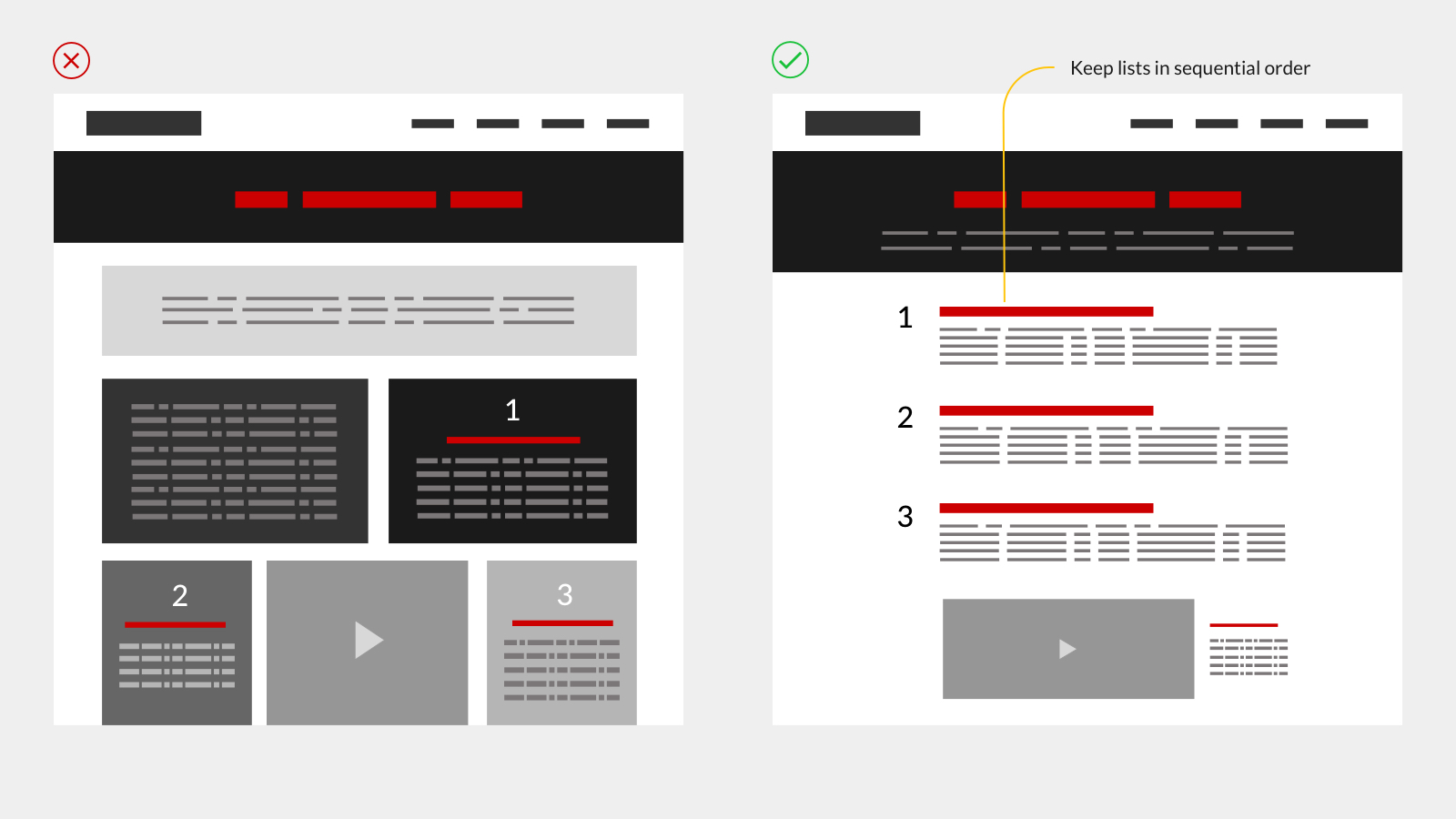
Continuity
The principle of continuity dictates that once the eye begins to follow something, it will continue traveling in that direction until it encounters another object. This principle strengthens the perception of grouped information guiding users through different content sections.
Arrangement of columns and lists are good examples of continuity. Sub-menus, navigation and card groupings also reinforce order and flow.